
# load the packages
library(readr)
library(tidyverse)
library(bbplot)
library(gganimate)
library(magrittr)
library(lubridate)

# load the data
mortgage <- read_csv("mortgage.csv",
                     col_types = cols(adjustable_margin_5_1_hybrid = col_double(),
                     adjustable_rate_5_1_hybrid = col_double(),
                     fees_and_pts_15_yr = col_double(), fees_and_pts_30_yr = col_double(),
                     fees_and_pts_5_1_hybrid = col_double(),
                     fixed_rate_15_yr = col_double(),
                     spread_30_yr_fixed_and_5_1_adjustable = col_double())
                     )
recessions <- read_csv("recessions.csv")
state_hpi <- read_csv("state_hpi.csv")
Week 6 has three data-sets, which are mortgage, recession and state_hpi. Number of variables in each data-set is less than 10. You can acquire the data-set from here.
#TidyTuesday What happened in the year 2000 !, and the 2007 recession has made some drastic changes in US avg and the Price index for all regions. What is happening to Hawaii? Code: https://t.co/WuZD9k8X3S pic.twitter.com/0ecmqnUsrJ
— Amalan Mahendran (@Amalan_Con_Stat) February 6, 2019
According to the description there is not much of variation in the recession data-set, but this is not the case in other two data-sets.
Mortgage
Mortgage data-set has 9 variables with 8 of them are related to the financial sector and one is refereed to date. So the below analysis or interpretation will be values changing over time. These values will be
- Fixed Rate 30 Years
- Fixed Rate 15 Years
- Fees and Percentage Points (30 Years) of the loan amount.
- Fees and Percentage Points (15 Years) of the loan amount.
Fixed Rate 30 Years from 1971 to 2018
Each week the Fixed Rate of 30 Years has been set and I am exploring how it changes in each year from 1971 to 2018. We can clearly see in the early Weeks of 1980 it has significantly increased higher than 17.5%, but in early 1970 it was only 7.5%.
By 1990 it has dropped to 7.5% and this pattern continues further until year 2018 where in December the Fixed Rate of 30 Years is slightly less than 5%.
Each year there can be one of the below patterns I mentioned if the year is divided into two half’s.
- First and Second Half of the Year hold the same Percentage points.
- First Half of the Year has Higher percentage Points than the second half.
- Vice versa of 2.
p<-ggplot(mortgage,aes(x=factor(year(date)),y=fixed_rate_30_yr,color=week(date)))+
          geom_jitter()+transition_time(year(date))+ease_aes("linear")+
          shadow_mark()+xlab("Year")+ylab("Fixed Rate 30 Year Mortgage (%)")+
          ggtitle("Fixed Rate 30 Year Morgage Change by the Year: {round(frame_time)}")+
          labs(color="Week of the Year")+
          theme(legend.position = "bottom",
                axis.text.x =element_text(angle = 90, hjust = 1))

animate(p,nframes=48, fps=1)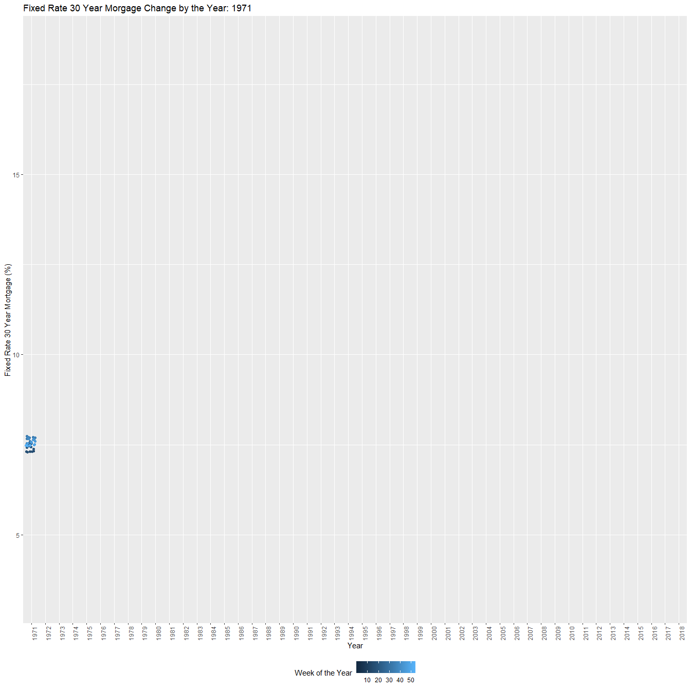
Fixed Rate 15 Years from 1991 to 2018
From 1991 only we have Fixed Rate for 15 Years and in the beginning we can see the percentage slightly above 8. and over the years it is decreasing while some fluctuations occur. This fluctuations happen in the years of 2000, 2006, 2007 and 2018, where they brake pattern of decreasing.
In the year 2018 it reaches slightly less than 4% in the first 20 or so weeks, but the last 20 weeks the percentage is above 4%.
p<-ggplot(subset(mortgage,year(date)>=1991),
          aes(x=factor(year(date)),y=fixed_rate_15_yr,color=week(date)))+
          geom_jitter()+transition_time(year(date))+ease_aes("linear")+
          shadow_mark()+xlab("Year")+ylab("Fixed Rate 15 Year Mortgage (%)")+
          ggtitle("Fixed Rate 15 Year Morgage Change by the Year: {round(frame_time)}")+
          labs(color="Week of the Year")+
          theme(legend.position = "bottom",
                axis.text.x =element_text(angle = 90, hjust = 1))

animate(p,nframes=28, fps=1)
Fees and Points of 30 Years from 1971 to 2018
Highest peek occurs in 1983 which is 2.7 and it decreases over the years gradually. While in the year 1971 the points were close to 1. The gradual decrease is not in effect between the years 1995 and 1996 and its clear in the plot. Yet, we can see no other anomaly in the next few years after 1996, while in 2007 it reaches its lowest point of slightly less than 0.3 (Could be related to the Great recession)
Anyway by year 2018 after this 2007 recession the points have increased but has not reached 1 and is always oscillating between 0.4 and 0.6 in the years of 2015 to 2018.
p1<-ggplot(mortgage,aes(x=factor(year(date)),y=factor(fees_and_pts_30_yr),color=week(date)))+
       geom_jitter()+ theme(legend.position = "bottom",
                            axis.text.x =element_text(angle = 90, hjust = 1))+
       xlab("Year")+ylab("Fees and Percentage points of the Loan Amount")+
       labs(color="Week of the Year")+
       ggtitle("Fess and Percentage points (30 Years) of the Loan Amount \n
                by the Year : {round(frame_time)}")+
       transition_time(year(date))+ease_aes("linear")+
       shadow_mark()

animate(p1,nframes=48, fps=1)
Fees and Points of 15 Years from 1991 to 2018
In 1991 the points are close to 1.9 and it wavers in between 1.6 and 1.8 until 1997. There is a significant drop from 1997 to 1998 where the points end up averaged around 1 and over the years it slowly decreases until year 2007. Where the lowest point of 0.3 occurs.
After this new low it struggles to maintain any steady increase and rather holds below 0.8 over the next few years until 2018.
p<-ggplot(subset(mortgage,year(date)>=1991),
          aes(x=factor(year(date)),y=factor(fees_and_pts_15_yr),color=week(date)))+
       geom_jitter()+ theme(legend.position = "bottom",
                            axis.text.x =element_text(angle = 90, hjust = 1))+
       xlab("Year")+ylab("Fees and Percentage points of the Loan Amount")+
       labs(color="Week of the Year")+
       ggtitle("Fees and Percentage points (15 Year)of the Loan Amount by the Year : {round(frame_time)}")+
       transition_time(year(date))+ease_aes("linear")+
       shadow_mark()

animate(p,nframes=28, fps=1)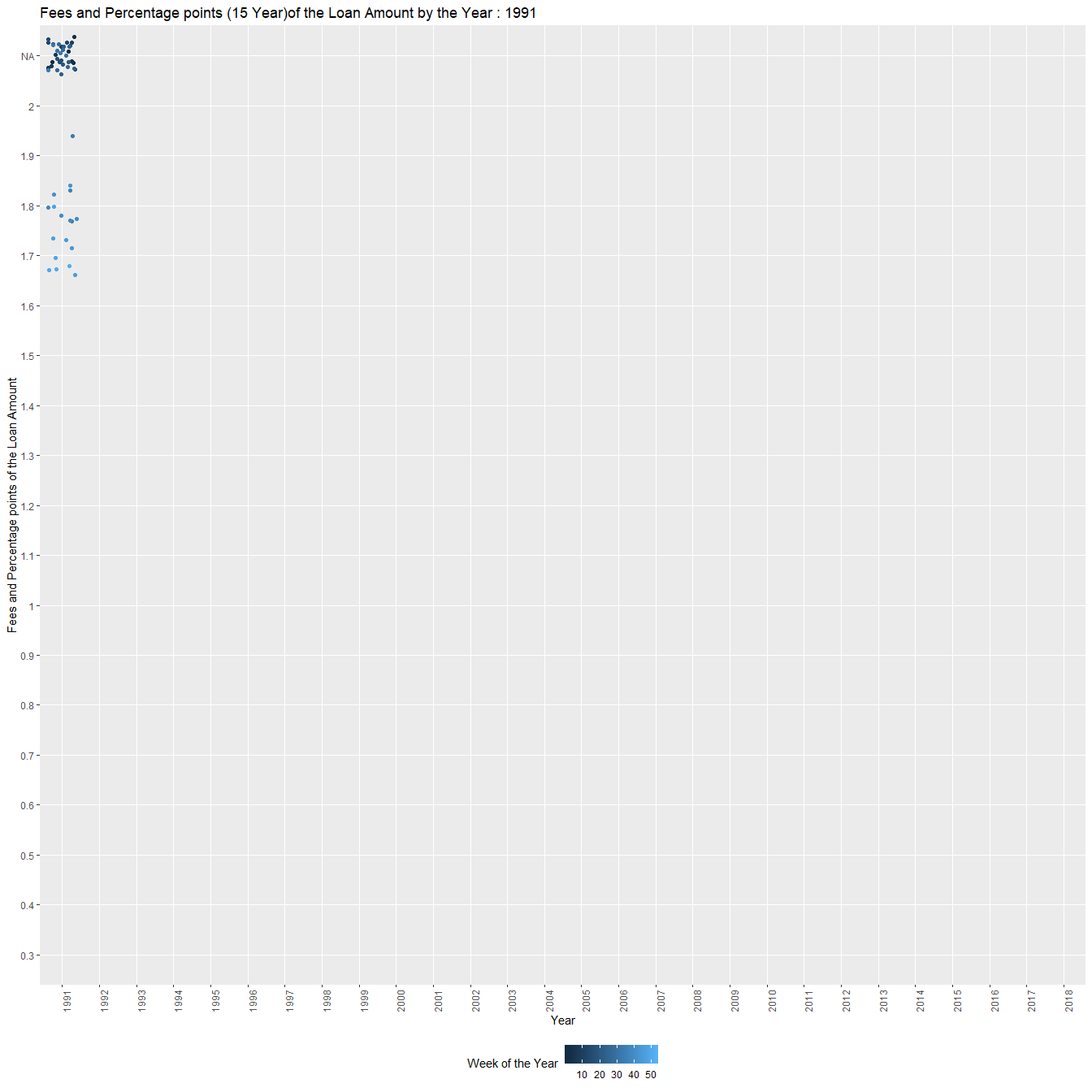
States
United States of America has 50 states and comparing all of them at the same time is a ludicrous idea. Therefore, I decided to combine few states and compare them as regions. In order to do this clustering I chose the Wikipedia page which was helpful for me.
There are multiple reasons to make different regions out of the 50 states of USA. But according to the Wikipedia page I figured it would be best to focus on the financial side or to be precise cluster of states based on the “Bureau of Economic Analysis Regions”.
So according to the above choice we have 8 regions clustering 50 states and they are
- New England
- Mideast
- Great Lakes
- Plains
- Southeast
- Southwest
- Rocky Mountain
- Far West
New England Region
Clear visibility of 2007 recession where US Avg and Price Index declining until 2010 and then improving over the next few years. All states begin very closely but end up very differently in 2018 and in troubled times.
p<-ggplot(subset(state_hpi,state=="CT"|state=="ME"|state=="MA"|
                           state=="NH"| state=="RI"|state=="VT"),
       aes(x=us_avg,y=price_index,color=state))+
       geom_point()+xlab("US Average")+ylab("Price Index")+
       ggtitle("Price Index vs Us Avg change over Year: {round(frame_time)}")+
       shadow_mark()+
       transition_time(year)+ease_aes("linear")
animate(p,nframes = 44,fps=1)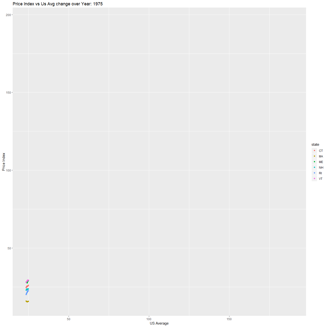
Mideast Region
After the 2007 recession there is clear difference among DC and other states and the gap cannot be ignored at all.
p<-ggplot(subset(state_hpi,state=="DE"|state=="DC"|state=="MD"|
                           state=="NJ"| state=="NY"|state=="PA"),
       aes(x=us_avg,y=price_index,color=state))+
       geom_point()+xlab("US Average")+ylab("Price Index")+
       ggtitle("Price Index vs Us Avg change over Year: {round(frame_time)}")+
       shadow_mark()+
       transition_time(year)+ease_aes("linear")
animate(p,nframes = 44,fps=1)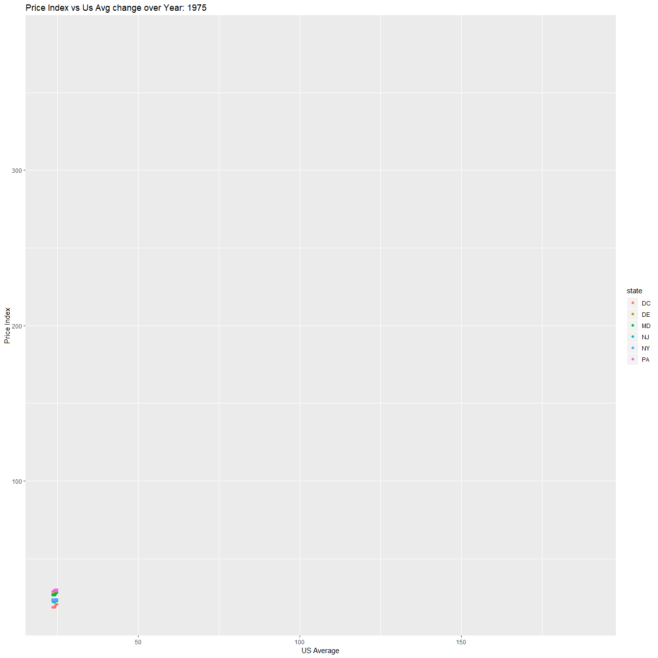
Great Lakes Region
After year 2000 there is clear difference among the 5 states and it becomes more complex with the 2007 recession and recovery periods. But this is not the case in year 2018 because all five states are now closely intact with the increase with both variables.
p<-ggplot(subset(state_hpi,state=="IL"|state=="OH"|state=="WI"|
                           state=="IN"| state=="MI"),
       aes(x=us_avg,y=price_index,color=state))+
       geom_point()+xlab("US Average")+ylab("Price Index")+
       ggtitle("Price Index vs Us Avg change over Year: {round(frame_time)}")+
       shadow_mark()+
       transition_time(year)+ease_aes("linear")
animate(p,nframes = 44,fps=1)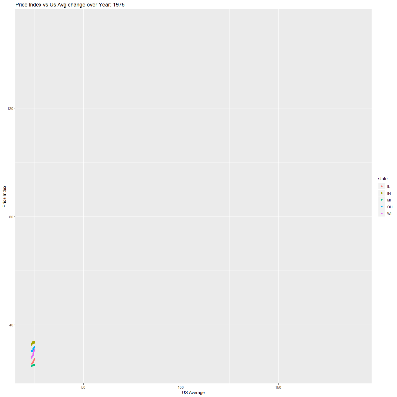
Plains Region
Before the 2007 recession all states behaved very similarly, but this is not the case after year 2011 where North Dakota has a higher Price index and US Average than other states which is clearly seen in the plot.
p<-ggplot(subset(state_hpi,state=="IO"|state=="MN"|state=="NE"|
                           state=="KS"| state=="MS"|state=="ND"|state=="SD"),
       aes(x=us_avg,y=price_index,color=state))+
       geom_point()+xlab("US Average")+ylab("Price Index")+
       ggtitle("Price Index vs Us Avg change over Year: {round(frame_time)}")+
       shadow_mark()+
       transition_time(year)+ease_aes("linear")
animate(p,nframes = 44,fps=1)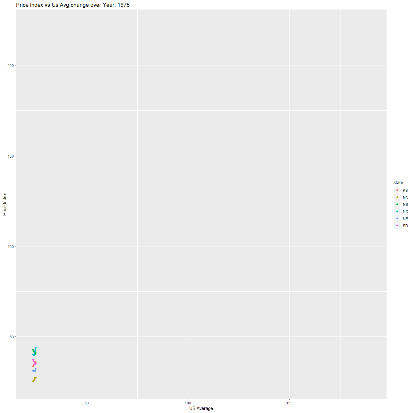
Southeast Region
Southeast region has alot of states therefore it would be time consuming to compare. Clearly the 2007 recession has a toll on both variables, but not as the effect from year 2000.
p<-ggplot(subset(state_hpi,state=="AL"|state=="FL"|state=="KY"|
                           state=="AR"|state=="GA"|state=="MS"|
                           state=="LA"|state=="NC"|state=="SC"|
                           state=="TN"|state=="VA"|state=="WV"),
       aes(x=us_avg,y=price_index,color=state))+
       geom_point()+xlab("US Average")+ylab("Price Index")+
       ggtitle("Price Index vs Us Avg change over Year: {round(frame_time)}")+
       shadow_mark()+
       transition_time(year)+ease_aes("linear")
animate(p,nframes = 44,fps=1)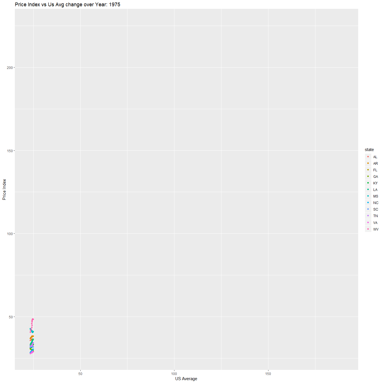
Southwest Region
Before the 2007 recession and after also we can see the clear changes. Before that in year 2000 also we can see rapid changes which lead up-to the recession. The damage done by the recession have not been recovered in some states even by 2018 according to the gap in Price index.
p<-ggplot(subset(state_hpi,state=="AZ"|state=="OK"|
                           state=="TX"|state=="NM"),
       aes(x=us_avg,y=price_index,color=state))+
       geom_point()+xlab("US Average")+ylab("Price Index")+
       ggtitle("Price Index vs Us Avg change over Year: {round(frame_time)}")+
       shadow_mark()+
       transition_time(year)+ease_aes("linear")
animate(p,nframes = 44,fps=1)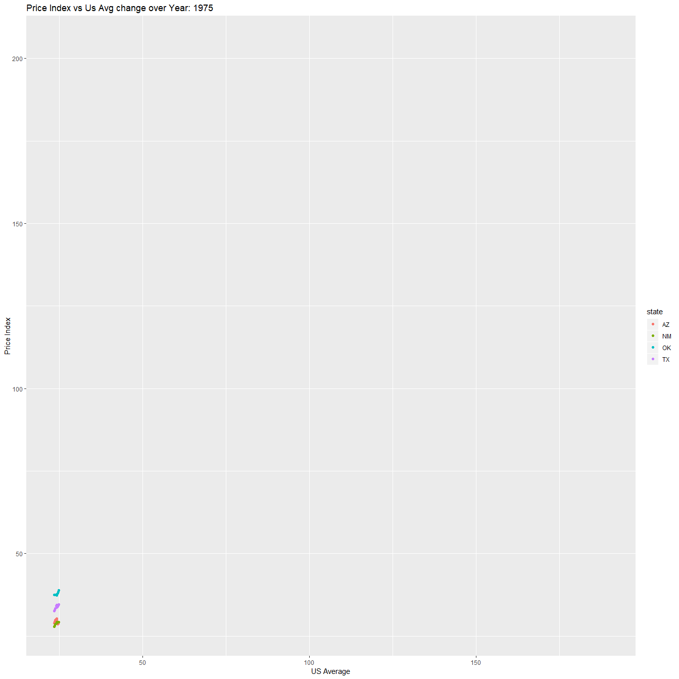
Rocky Mountain Region
Changes after 2000 are very different for the 5 states in this region and after the 2007 recession also we can see the rapid set back in Us avg and price index. But this is not the case after 2013 even though it has already made significant amount of divide between the state of MO and other states, which is clearly seen at the end of year 2018.
p<-ggplot(subset(state_hpi,state=="CO"|state=="MO"|state=="WY"|
                           state=="ID"| state=="UT"),
       aes(x=us_avg,y=price_index,color=state))+
       geom_point()+xlab("US Average")+ylab("Price Index")+
       ggtitle("Price Index vs Us Avg change over Year: {round(frame_time)}")+
       shadow_mark()+
       transition_time(year)+ease_aes("linear")
animate(p,nframes = 44,fps=1)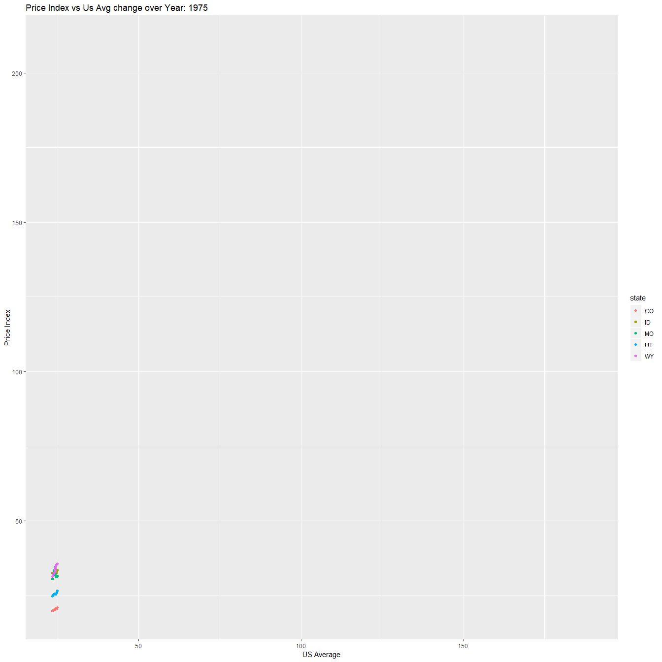
Far West Region
Early 1990 has a sudden raise and it quickly settles down close to year 1998. Where by 2000 all six states share the same price index value, but this changes over time with clear difference among two groups. Each group containing 3 states, but this progress entirely changes by the 2007 recession and its recovery. Because clearly after 2013 there is no more 2 groups, it is now 3 groups. Where state of Hawaii has the highest pricing index and lowest goes to Alaska, this is by the end of year 2018.
p<-ggplot(subset(state_hpi,state=="AL"|state=="NV"|state=="OR"|
                           state=="CA"| state=="HI"|state=="WA"),
       aes(x=us_avg,y=price_index,color=state))+
       geom_point()+xlab("US Average")+ylab("Price Index")+
       ggtitle("Price Index vs Us Avg change over Year: {round(frame_time)}")+
       shadow_mark()+
       transition_time(year)+ease_aes("linear")
animate(p,nframes = 44,fps=1)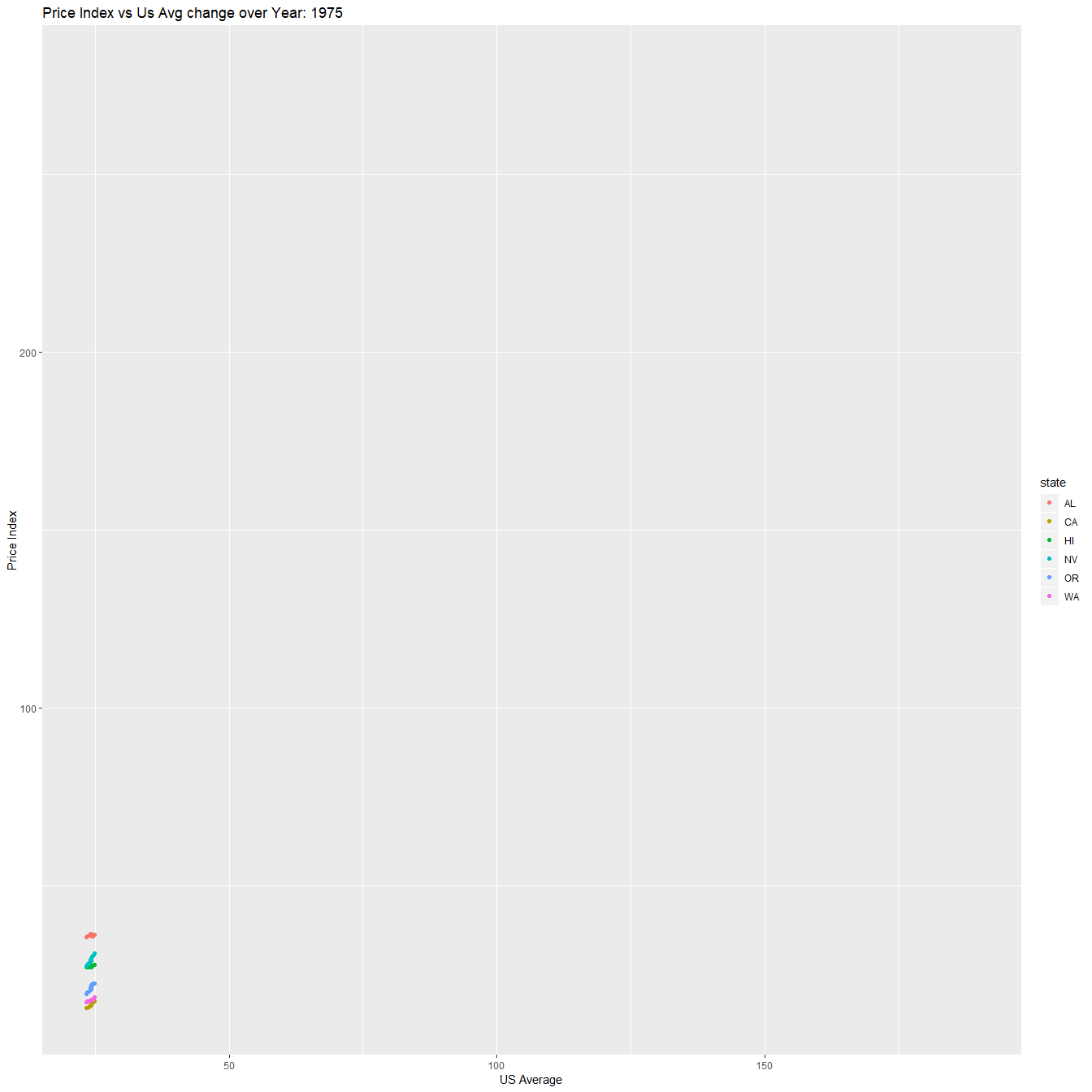
It might look that I have not done enough justice for the changes which occurred before the year 2000, and I do agree with you. But if I do add them into my consideration this article would be very long. Hopefully, the animated plots clearly indicate the strong changes which occurred in the pre-y2k era.
THANK YOU