# load the packages
library(readr)
library(tidyverse)
library(magrittr)
library(gganimate)
library(ggthemr)

# load the theme
ggthemr("flat dark")

# load the data
pretrial_summary <- read_csv("pretrial_summary.csv")

prison_summary <- read_csv("prison_summary.csv")

incarceration_trends<-read_csv("incarceration_trends.csv")
TidyTuesday Week 4 of 2019 is focused on prison data. You can find the data here. There are 5 csv files, clearly 2 files are a summary of the main data, which are Prison Summary and Pretrial Summary.
Code: https://t.co/x1Wiq1JzYS . opinion: Decline of prisoners rate after certain periods for different regions. #tidytuesday pic.twitter.com/VkOJDJJBoq
— Amalan Mahendran (@Amalan_Con_Stat) January 22, 2019
I have mainly focused on these two data-sets here. Further in order of curiosity I did take a peak at a main data file, which is incarceration_trends.csv.
Prison Summary
Prison summary data-set has 4 variables. The year of records begin from 1983 and ends in 2015. The unit of incarceration in is Rate per 100,000. Considering the population categories there are clearly 4 sub groups. Each of these sub groups have been plotted here. Further the variable ‘urbanicity’ is simply grouping the observations according to the developed status. Such as rural, small/mid, suburban and urban.
Prison Summary With Gender
The population increase has an effect on it according to the below plot. Urban area has an increase in these prisoners over the years but after mid 1990 there is a decline. This is true for males. Next considering the suburban area this is quite similar as before, only difference is that the decline begins in year 2005.
Considering rural area there is a clear increase of prisoners for both genders in the years. There is an anomaly in year 1986 with alot of prisoners for males. Both rural and small/mid areas behave similarly for both genders as the increase rate gets somewhat slower after 2010.
subset(prison_summary,pop_category=="Male" | pop_category=="Female") %>%
ggplot(.,aes(x=year,y=rate_per_100000,fill=pop_category))+
  facet_wrap(~urbanicity)+geom_area()+
  transition_reveal(year)+ labs(fill="Gender")+
  scale_x_continuous(breaks=c(1983:2015),labels=c(1983:2015))+
  theme(axis.text.x = element_text(angle = 90),legend.position = "bottom")+
  scale_y_continuous(breaks = seq(0,1750,250),labels=seq(0,1750,250))+
  xlab("Year")+ylab("Rate per 100,000")+
  ggtitle("Gender change over the years from 1983-2015")
Prison Summary with Ethnicity
5 ethnicity types are considered here which are Asian, Black, Latino, White and Native American. From 1980 only we can see the active prisoners of Latino and Native American ethnicity. Over the years we can the increase of prisoners for African American Community. The increase is very high considering the other ethnicity types.
Asian ethnicity people have prisoners but it is only negligible considering the other ethnicity types. Except the suburban area others have an increase rate until 2005 and there is a decline followed in the next years. This is not the case for suburban area. Here less change after year 2000 and the decline begins only in year 2010.
subset(prison_summary,pop_category == "Asian" | pop_category=="Black" |
                      pop_category == "Latino" |pop_category=="White" |
                      pop_category == "Native American" ) %>%
ggplot(.,aes(x=year,y=rate_per_100000,fill=pop_category))+
  facet_wrap(~urbanicity)+geom_area()+
  transition_reveal(year)+ labs(fill="Ethnicity")+
  scale_x_continuous(breaks=c(1983:2015),labels=c(1983:2015))+
  theme(axis.text.x = element_text(angle = 90),legend.position = "bottom")+
  scale_y_continuous(breaks = seq(0,5250,250),labels=seq(0,5250,250))+
  xlab("Year")+ylab("Rate per 100,000")+
  ggtitle("Ethnicity change over the years from 1983-2015")
Prison Summary with Other and Total
The Other category is no longer active since 1989, but before that we can see different anomalies in all four areas. Clearly urban area has more prisoners and final place goes to suburban according to the below area plot.
Rural area has an increase in prisoners over the years and there is no decline. This is not the case for small/mid and suburban areas. Urban areas has a sudden decline in between year 1995 to 2000 and again there is a steep decline after year 2005.
subset(prison_summary,pop_category == "Other" | pop_category=="Total") %>%
ggplot(.,aes(x=year,y=rate_per_100000,fill=pop_category))+
    facet_wrap(~urbanicity)+geom_area()+
    transition_reveal(year)+ labs(fill="Category")+
    scale_x_continuous(breaks=c(1983:2015),labels=c(1983:2015))+
    theme(axis.text.x = element_text(angle = 90),legend.position = "bottom")+
    scale_y_continuous(breaks = seq(0,1000,100),labels=seq(0,1000,100))+
    xlab("Year")+ylab("Rate per 100,000")+
    ggtitle("Total and Other category change over the years from 1983-2015")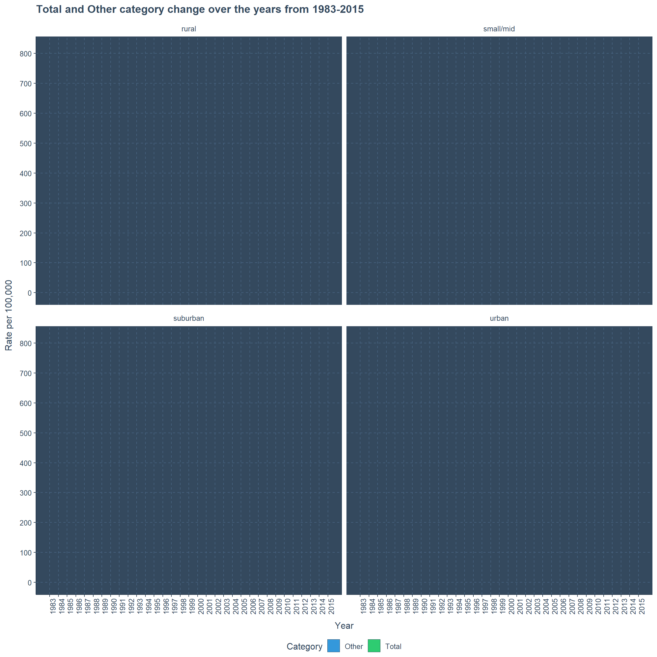
Pretrial Summary with Gender and Total
Year 1970 to 2015 is the range of time considered here and the genders male and female are considered with the total. The data-set is for Pretrial prisoners. There is sudden increase after mid 1980s to all the areas. This sudden increase occurs to both genders and the total as well.
Here, also we can see an odd behavior for urban area in the entire time range with sudden steeps and peaks.
ggplot(pretrial_summary,aes(x=year,y=rate_per_100000,fill=pop_category))+
      geom_area()+facet_wrap(~urbanicity)+
      transition_reveal(year)+ labs(fill="Category")+
      scale_x_continuous(breaks=c(1970:2015),labels=c(1970:2015))+
      theme(axis.text.x = element_text(angle = 90),legend.position = "bottom")+
      scale_y_continuous(breaks = seq(0,800,50),labels=seq(0,800,50))+
      xlab("Year")+ylab("Rate per 100,000")+
      ggtitle("Total and Gender category change over the years from 1970-2015")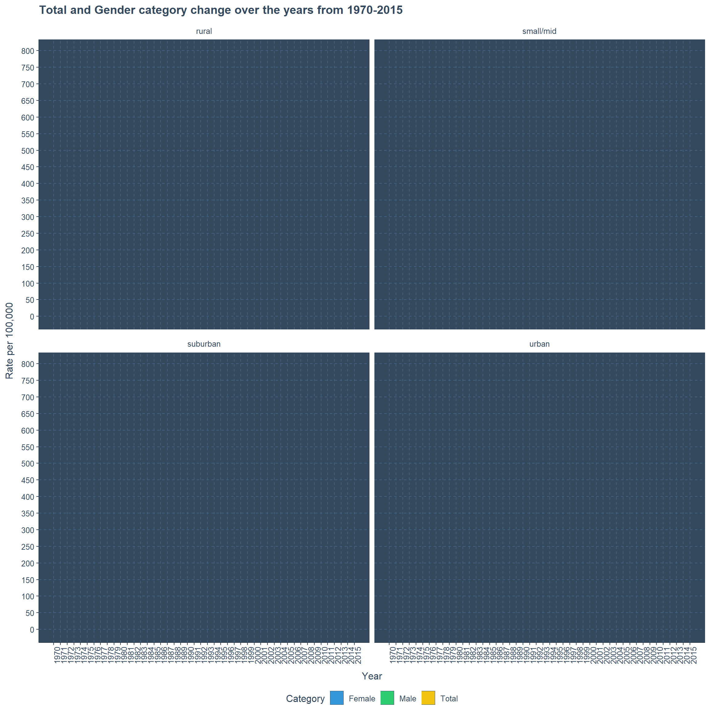
Complete Data of Incarceration Trends
This data-set has all the necessary information related to Incarceration. Further, it includes data for 11 different crime types. Rather than exploring all the crimes I have explored only one crime here, which is Rape.
The are four areas in concern are rural, suburban, mid/small and urban. 51 states and 4 regions are considered to see the diversity of these prisoners. We have dropped the years from 1970 to 1976, 2015 and 2016 because they had no data. Even the years 1979 and 1993 has missing data but still I am including this in the plot.
Rape Crimes over the Years in States of Rural Area
I developed these plots to understand a pattern in state wise or region wise, apparently its very difficult but still I am keeping these plots here. Well, frankly I think there could be some other better way to visualize the above selective data.
p1<-subset(incarceration_trends,year!="1970" & year!="1971" & year!="1972" &
                            year!="1973" & year!="1974" & year!="1975" &
                            year!="1976" & year!="2015" & year!="2016" &
                            urbanicity == "rural",
       select = c("year","state","rape_crime","urbanicity","region")) %>%
ggplot(.,aes(x=factor(state),y=rape_crime,color=region))+
      geom_jitter(width = 0.1)+transition_time(year)+
      coord_flip()+
      ylab("Rape Crime")+xlab("State")+
      theme(legend.position = "bottom")+
      labs(title="Rape Crime for Rural Areas on the Year : {round(frame_time)}")

animate(p1,fps=1,duration=38)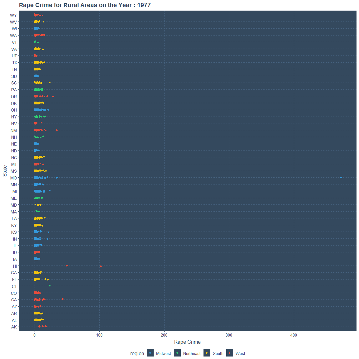
Rape Crimes over the Years in States of Small or Mid Area
p2<-subset(incarceration_trends,year!="1970" & year!="1971" & year!="1972" &
                            year!="1973" & year!="1974" & year!="1975" &
                            year!="1976" & year!="2015" & year!="2016" &
                            urbanicity == "small/mid",
       select = c("year","state","rape_crime","urbanicity","region")) %>%
ggplot(.,aes(x=factor(state),y=rape_crime,color=region))+
      geom_jitter(width = 0.1)+transition_time(year)+
      coord_flip()+
      ylab("Rape Crime")+xlab("State")+
      theme(legend.position = "bottom")+
      labs(title="Rape Crime for Small or Mid Areas on the Year: {round(frame_time)}")

animate(p2,fps=1,duration=38)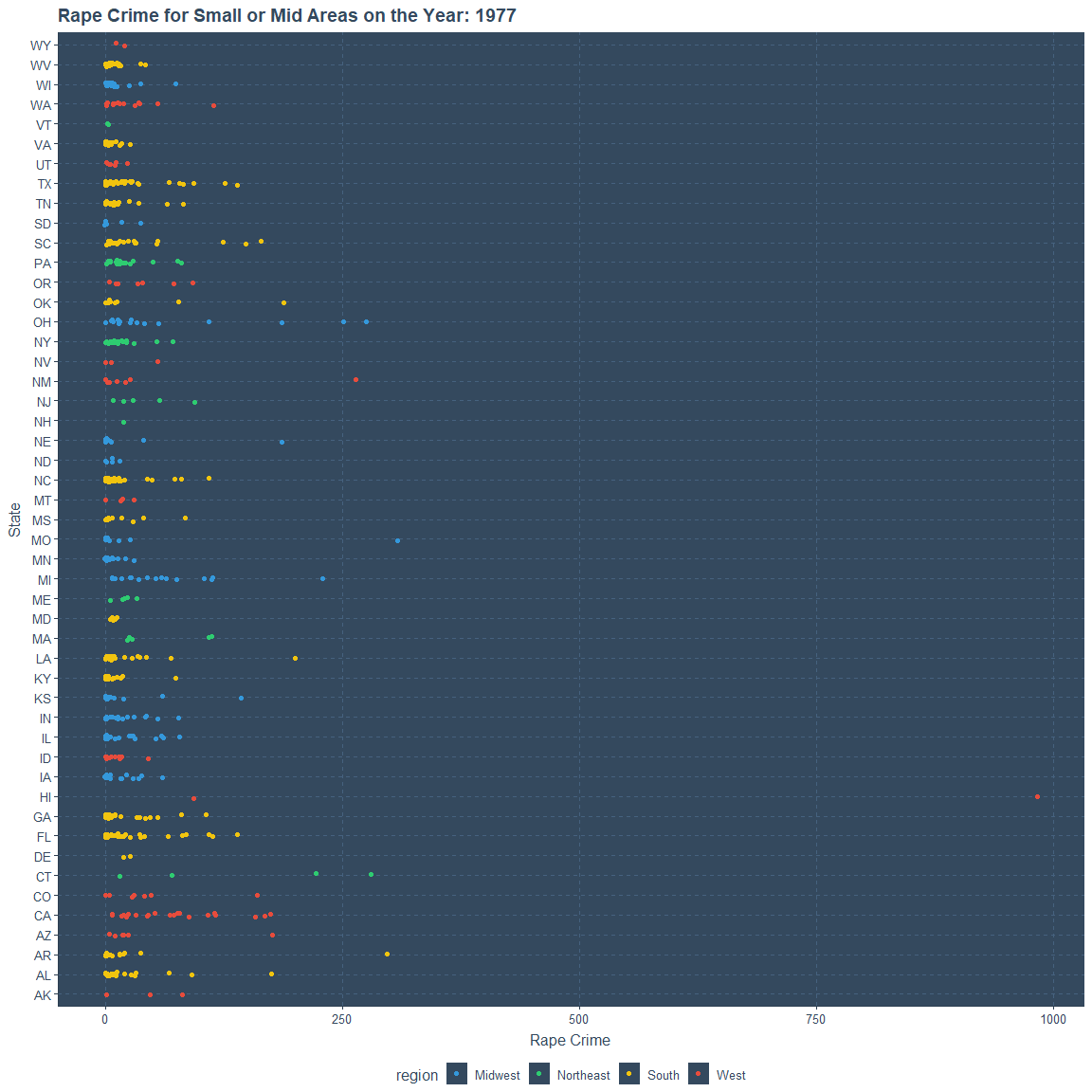
Rape Crimes over the Years in States of Suburban Area
p3<-subset(incarceration_trends,year!="1970" & year!="1971" & year!="1972" &
                            year!="1973" & year!="1974" & year!="1975" &
                            year!="1976" & year!="2015" & year!="2016" &
                            urbanicity == "suburban",
       select = c("year","state","rape_crime","urbanicity","region")) %>%
ggplot(.,aes(x=factor(state),y=rape_crime,color=region))+
      geom_jitter(width = 0.1)+transition_time(year)+
      coord_flip()+
      ylab("Rape Crime")+xlab("State")+
      theme(legend.position = "bottom")+
      labs(title="Rape Crime for Suburban Areas on the Year: {round(frame_time)}")

animate(p3,fps=1,duration=38)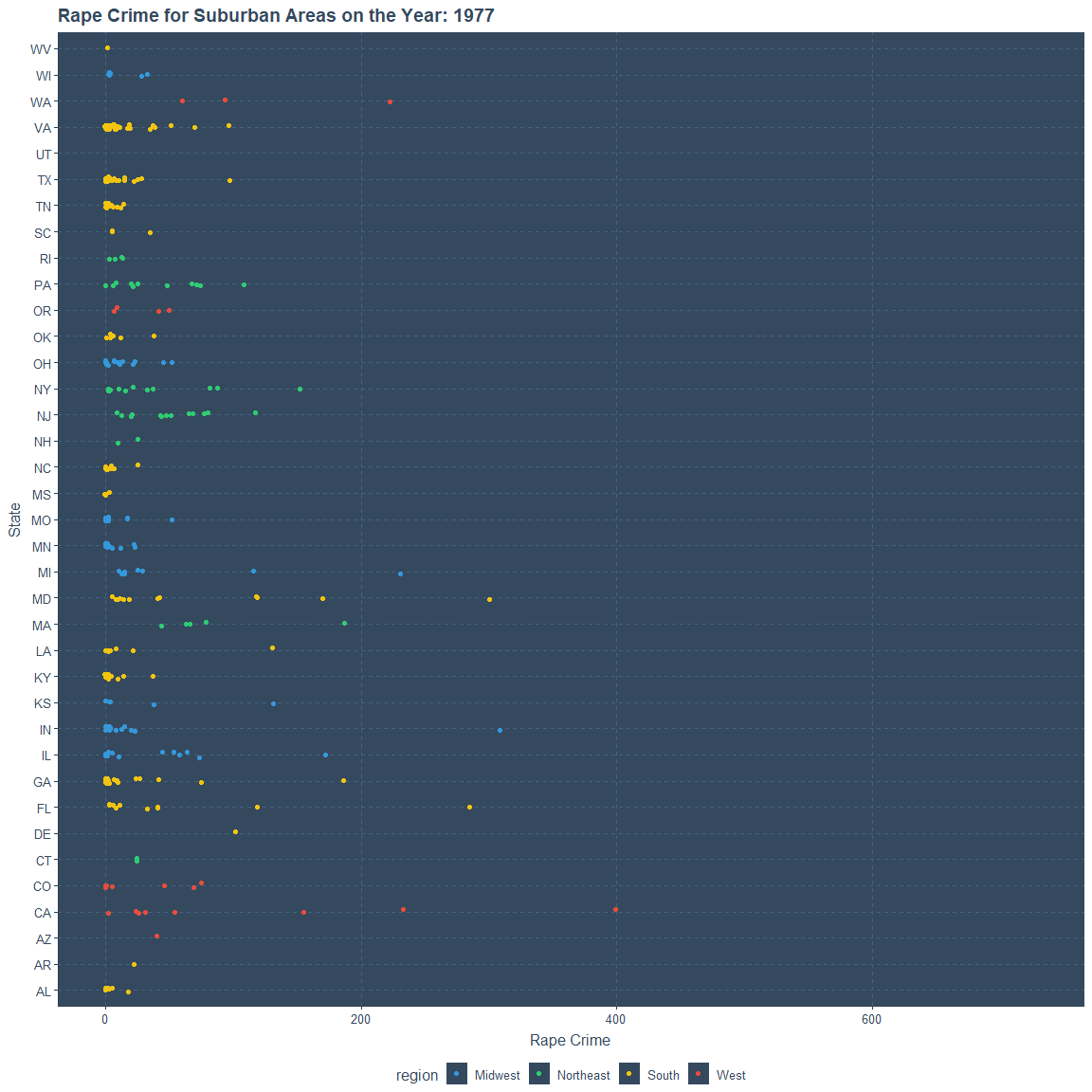
Rape Crimes over the Years in States of Urban Area
p4<-subset(incarceration_trends,year!="1970" & year!="1971" & year!="1972" &
                            year!="1973" & year!="1974" & year!="1975" &
                            year!="1976" & year!="2015" & year!="2016" &
                            urbanicity == "urban",
       select = c("year","state","rape_crime","urbanicity","region")) %>%
ggplot(.,aes(x=factor(state),y=rape_crime,color=region))+
      geom_jitter(width = 0.1)+transition_time(year)+
      coord_flip()+
      ylab("Rape Crime")+xlab("State")+
      theme(legend.position = "bottom")+
      labs(title="Rape Crime for Urban Areas on the Year: {round(frame_time)}")

animate(p4,fps=1,duration=38)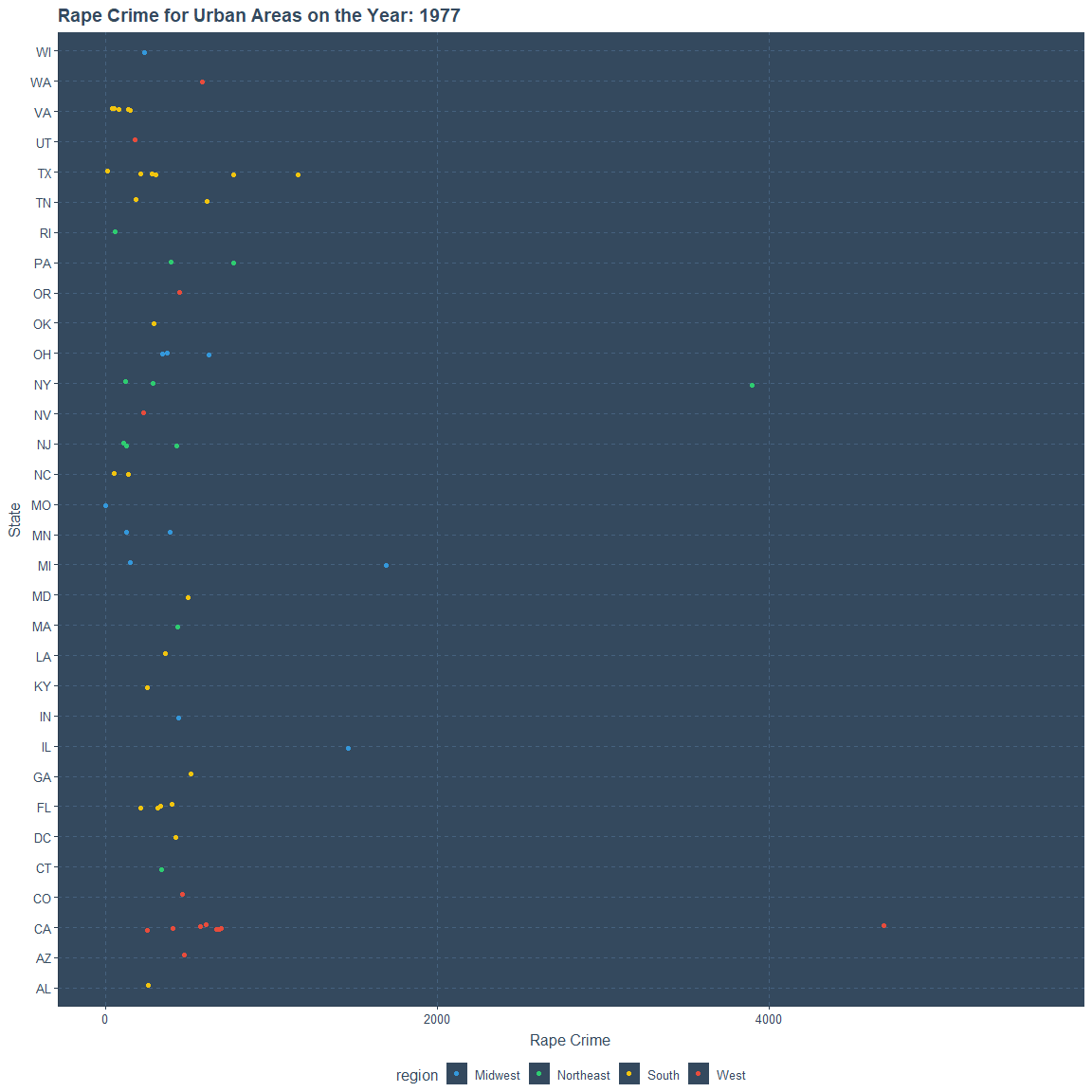
THANK YOU