# load the packages
library(readr)
library(tidyverse)
library(tidylog)
library(gganimate)
library(splitstackshape)
library(ggthemr)

# load the theme
ggthemr("chalk")

# load the data
board_games <- read_csv("board_games.csv")
Board Games data-set contains a lot of variables yet i will be focusing on only a few of them here. They are category, year_published, average_rating, users_rated, max_players, max_playtime, min_players and min_playtime. Mostly the plots will identify patterns how over the years variables change with the help of jitter/point plots. Slightly above 10,000 observations are in this data-set
#TidyTuesday In the mid-2010s, card games as the first category are higher!!!!!!!!!!. Code: https://t.co/1e5zotWApC pic.twitter.com/QebdFPAJuE
— Amalan Mahendran (@Amalan_Con_Stat) March 12, 2019
Minimum No of Players and Minimum Play Time
If we consider minimum no of players and minimum play time we can see how the data points are spread out. In order to understand clearly we have changed the limits of x-axis and y-axis twice.
General
p<-ggplot(board_games,aes(min_players,min_playtime))+
          geom_jitter()+transition_time(year_published)+
          ease_aes("linear")+
          xlab("Minimum No of Players")+
          ylab("Minimum Playing Time")+
          scale_x_continuous(breaks=seq(0,9),labels = seq(0,9))+
          scale_y_continuous(breaks = seq(0,60000,5000),labels=seq(0,60000,5000))+
          ggtitle("Minimum No of Players vs Minimum Playing Time",
                  subtitle ="Year :{frame_time}" )

animate(p,nframes=67,fps=1)
Scrutinized
p<-subset(board_games, min_playtime < 5000) %>%
   ggplot(.,aes(min_players,min_playtime))+
          geom_jitter()+transition_time(year_published)+
          ease_aes("linear")+
          xlab("Minimum No of Players")+
          ylab("Minimum Playing Time")+
          scale_x_continuous(breaks=seq(0,9),labels = seq(0,9))+
          scale_y_continuous(breaks = seq(0,5000,500),labels=seq(0,5000,500))+
          ggtitle("Minimum No of Players vs Minimum Playing Time",
                  subtitle ="Year :{frame_time}" )

animate(p,nframes=67,fps=1)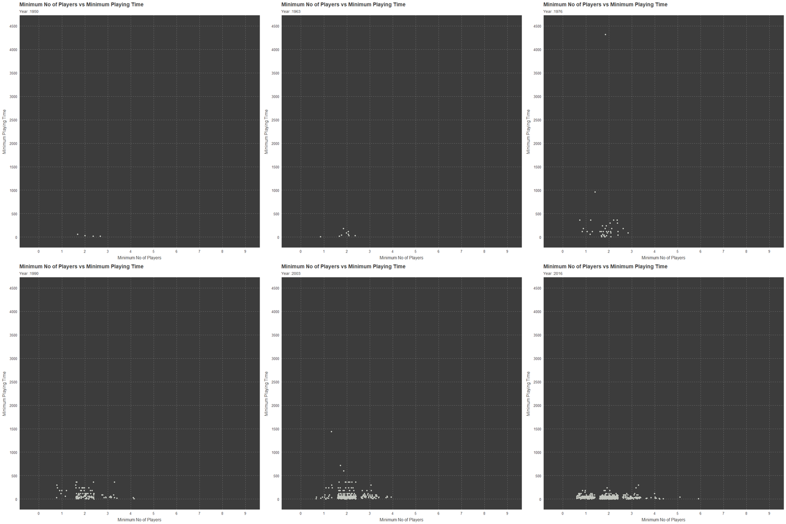
More Scrutinized
p<-subset(board_games, min_playtime < 500) %>%
   ggplot(.,aes(min_players,min_playtime))+
          geom_jitter()+transition_time(year_published)+
          ease_aes("linear")+
          xlab("Minimum No of Players")+
          ylab("Minimum Playing Time")+
          scale_x_continuous(breaks=seq(0,9),labels = seq(0,9))+
          scale_y_continuous(breaks = seq(0,500,50),labels=seq(0,500,50))+
          ggtitle("Minimum No of Players vs Minimum Playing Time",
                  subtitle ="Year :{frame_time}" )

animate(p,nframes=67,fps=1)
Maximum No of Players and Maximmum Play Time
Similarly, we are generating three plots to understand how Maximum No of Players and Maximum Play Time is behaving. Below are the three plots.
General
p<-ggplot(board_games,aes(max_players,max_playtime))+
          geom_jitter()+transition_time(year_published)+
          ease_aes("linear")+
          xlab("Maximum No of Players")+
          ylab("Maximum Playing Time")+
          scale_x_continuous(breaks=seq(0,1000,50),labels = seq(0,1000,50))+
          scale_y_continuous(breaks = seq(0,60000,5000),labels=seq(0,60000,5000))+
          ggtitle("Maximum No of Players vs Maximum Playing Time",
                  subtitle ="Year :{frame_time}" )

animate(p,nframes=67,fps=1)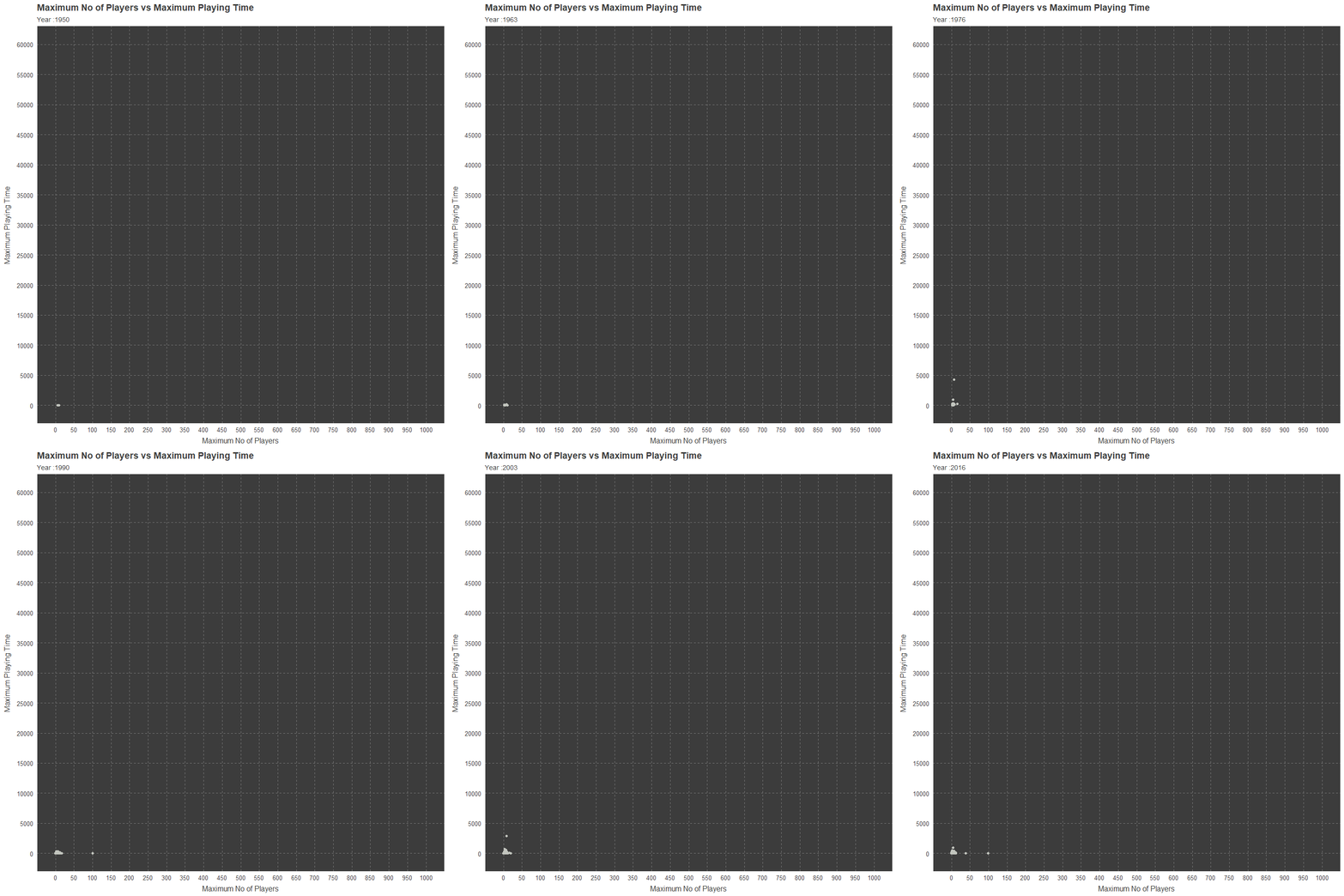
Scrutinized
p<-subset(board_games,max_players< 125 & max_playtime < 10000) %>%
   ggplot(.,aes(max_players,max_playtime))+
          geom_jitter()+transition_time(year_published)+
          ease_aes("linear")+
          xlab("Maximum No of Players")+
          ylab("Maximum Playing Time")+
          scale_x_continuous(breaks=seq(0,100,10),labels = seq(0,100,10))+
          scale_y_continuous(breaks = seq(0,6000,500),labels=seq(0,6000,500))+
          ggtitle("Maximum No of Players vs Maximum Playing Time",
                  subtitle ="Year :{frame_time}" )

animate(p,nframes=67,fps=1)
More Scrutinized
p<-subset(board_games,max_players< 15 & max_playtime < 1000) %>%
   ggplot(.,aes(max_players,max_playtime))+
          geom_jitter()+transition_time(year_published)+
          ease_aes("linear")+
          xlab("Maximum No of Players")+
          ylab("Maximum Playing Time")+
          scale_x_continuous(breaks=seq(0,15),labels = seq(0,15))+
          scale_y_continuous(breaks = seq(0,1000,50),labels=seq(0,1000,50))+
          ggtitle("Maximum No of Players vs Maximum Playing Time",
                  subtitle ="Year :{frame_time}" )

animate(p,nframes=67,fps=1)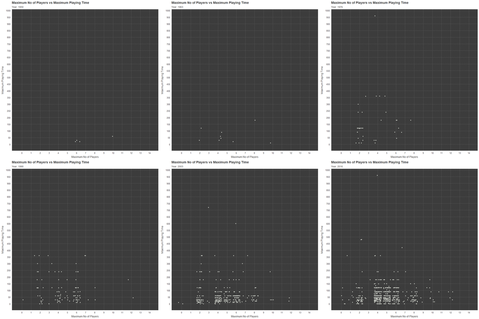
Maximum No of Players and Average Rating
Next is plotting the variables Maximum No of Players and Average Rating. Where over the time period from 1950 to 2016 the data is plotted here. There is three stages of plotting here also. Below is the code and plots.
General
p<-ggplot(board_games,aes(max_players,average_rating))+
          geom_jitter()+transition_time(year_published)+
          ease_aes("linear")+
          xlab("Maximum No of Players")+
          ylab("Average Rating")+
          scale_x_continuous(breaks=seq(0,1000,50),labels = seq(0,1000,50))+
          scale_y_continuous(breaks = seq(0,10,.5),labels=seq(0,10,.5))+
          ggtitle("Maximum No of Players vs Average Rating",
                  subtitle ="Year :{frame_time}" )

animate(p,nframes=67,fps=1)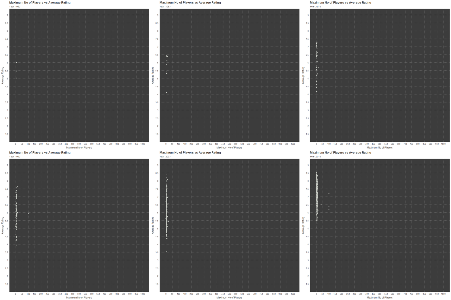
Scrutinized
p<-subset(board_games,max_players <75 ) %>%
   ggplot(.,aes(max_players,average_rating))+
          geom_jitter()+transition_time(year_published)+
          ease_aes("linear")+
          xlab("Maximum No of Players")+
          ylab("Average Rating")+
          scale_x_continuous(breaks=seq(0,75,5),labels = seq(0,75,5))+
          scale_y_continuous(breaks = seq(0,10,.5),labels=seq(0,10,.5))+
          ggtitle("Maximum No of Players vs Average Rating",
                  subtitle ="Year :{frame_time}" )

animate(p,nframes=67,fps=1)
More Scrutinized
p<-subset(board_games,max_players <15 ) %>%
   ggplot(.,aes(max_players,average_rating))+
          geom_jitter()+transition_time(year_published)+
          ease_aes("linear")+
          xlab("Maximum No of Players")+
          ylab("Average Rating")+
          scale_x_continuous(breaks=seq(0,15),labels = seq(0,15))+
          scale_y_continuous(breaks = seq(0,10,.5),labels=seq(0,10,.5))+
          ggtitle("Maximum No of Players vs Average Rating",
                  subtitle ="Year :{frame_time}" )

animate(p,nframes=67,fps=1)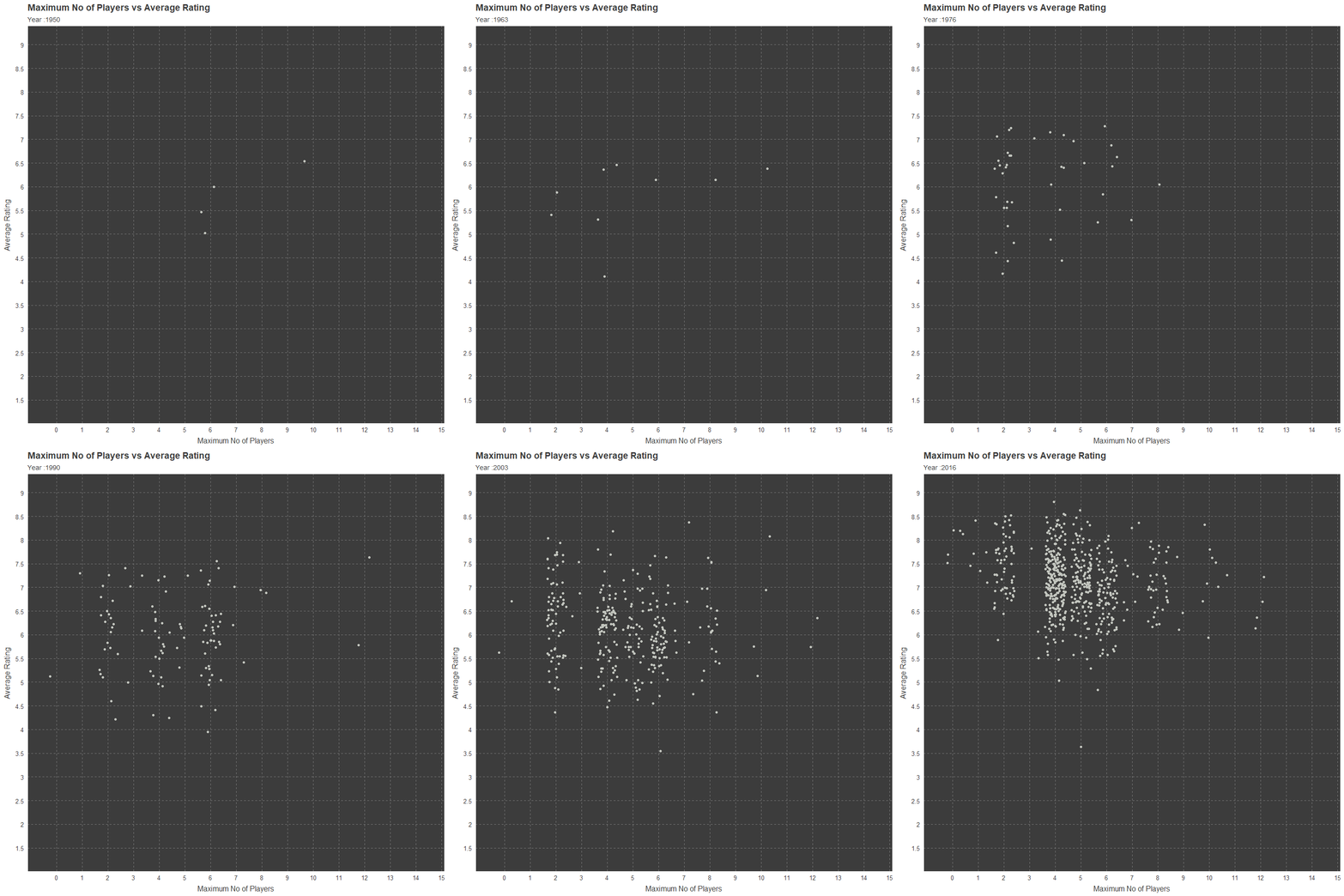
Average Rating and Users Rated
Now I am focusing on Average Rating with Users Rated, where the former is in a scale from 1 to 10 and the latter is just count.
Animated
p<-ggplot(board_games,aes(average_rating,users_rated))+
          geom_point()+transition_time(year_published)+
          ease_aes("linear")+
          ylab("Users Rated")+
          xlab("Average Rating")+
          scale_x_continuous(breaks=seq(0,10,.5),labels = seq(0,10,.5))+
          scale_y_continuous(breaks = seq(0,70000,2500),labels=seq(0,70000,2500))+
          ggtitle("Average Rating vs Users Rated",
                  subtitle ="Year :{frame_time}" )

animate(p,nframes=67,fps=1)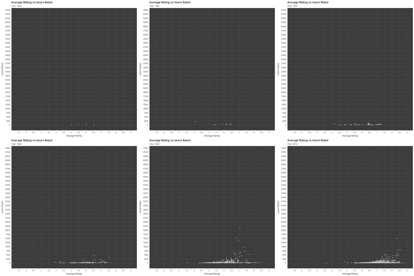
Not Animated
ggplot(board_games,aes(average_rating,users_rated,color=year_published))+
          geom_point(alpha=0.85)+
          labs(color="Year")+
          ylab("Users Rated")+
          xlab("Average Rating")+
          scale_x_continuous(breaks=seq(0,10,.5),labels = seq(0,10,.5))+
          scale_y_continuous(breaks = seq(0,70000,2500),labels=seq(0,70000,2500))+
          ggtitle("Average Rating vs Users Rated",
                  subtitle ="Year : 1950 to 2016" )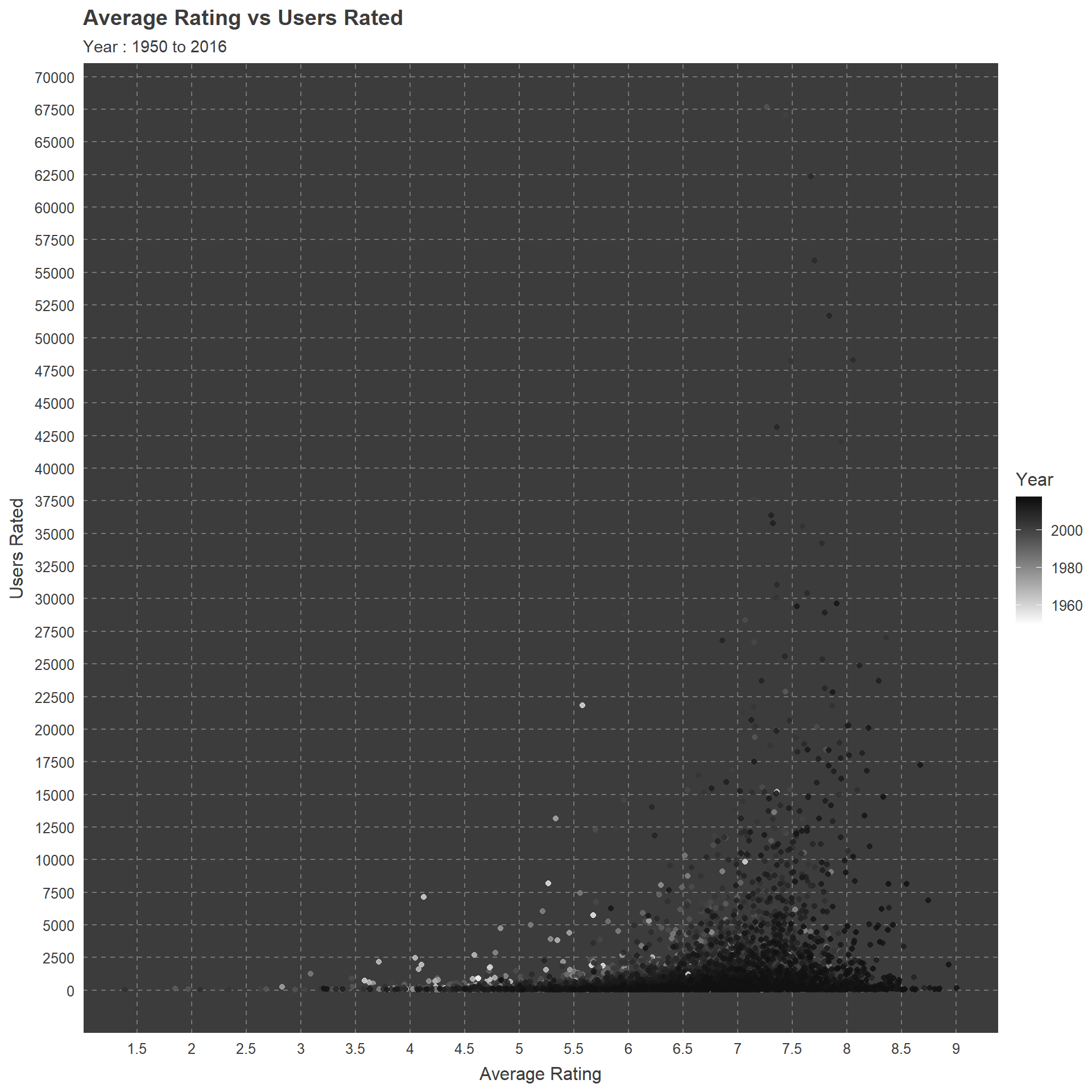
Category and Rating
Finally, there are two plots which focuses on board games which has average rating above 7 with category. Even though a game can have multiple categories here I have chosen the first four while ignoring the others. Because most of the games do not have a third category it would be pointless in my perspective.
General and Category 1
p<-board_games %>%
   select(year_published,category,average_rating) %>%
   cSplit("category",sep=",") %>%
   gather(Groups,category,"category_01","category_02","category_03","category_04") %>%
   select(year_published,Groups,category,average_rating) %>%
   subset(Groups=="category_01" & average_rating > 7)%>%
   ggplot(.,aes(category,average_rating))+geom_jitter()+
   coord_flip()+xlab("Category")+ylab("Average Rating")+
   transition_time(year_published)+ease_aes("linear")+
   ggtitle("Average Rating for First Category",
           subtitle = "Year: {floor(frame_time)}")

animate(p,fps=1,nframes=54)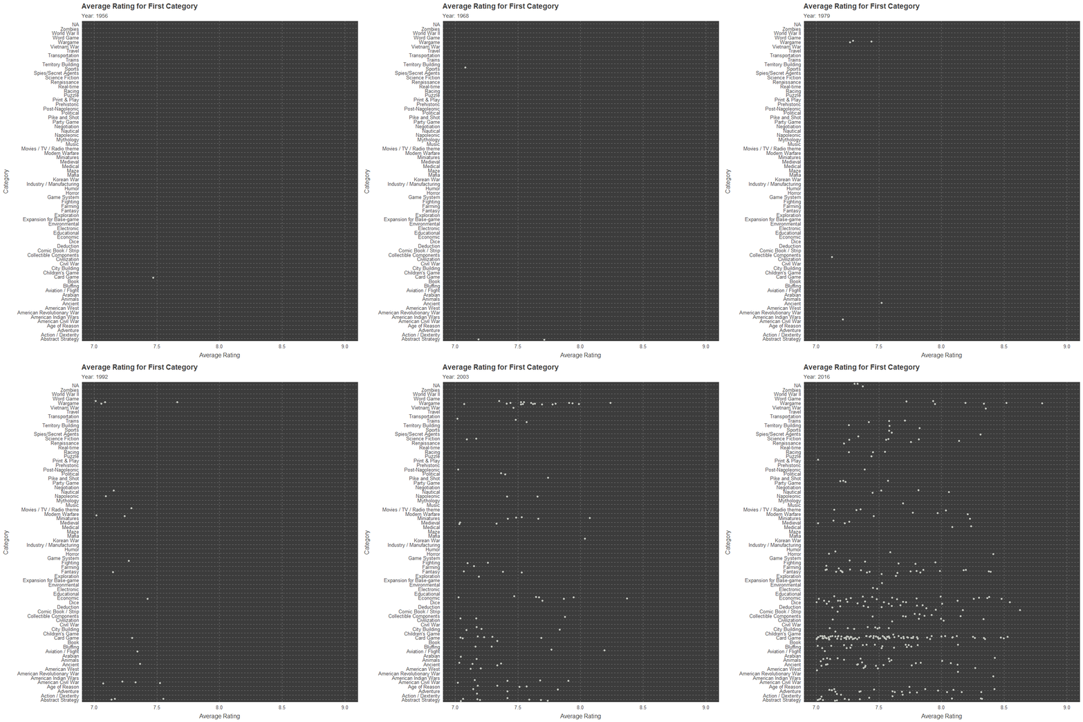
General and Category 2
p<-board_games %>%
   select(year_published,category,average_rating) %>%
   cSplit("category",sep=",") %>%
   gather(Groups,category,"category_01","category_02","category_03","category_04") %>%
   select(year_published,Groups,category,average_rating) %>%
   subset(Groups=="category_02" & average_rating >7)%>%
   ggplot(.,aes(category,average_rating))+geom_jitter()+
   coord_flip()+xlab("Category")+ylab("Average Rating")+
   transition_time(year_published)+ease_aes("linear")+
   ggtitle("Average Rating for Second Category",
           subtitle = "Year: {floor(frame_time)}")

animate(p,fps=1,nframes=54)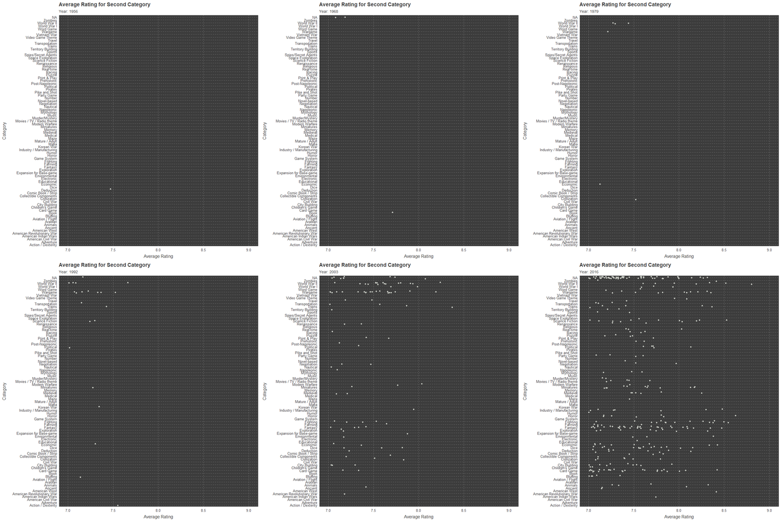
THANK YOU

